TECNOAMBASSADOR · PRESTASHOP MODULE
Tecno Banners
Linked images on computers and a slider on phones.
|
| Take your customers straight to what you want to sell. Tecno Banners shows several linked images side by side on computers and turns them into a one-image slider on phones. Images are never stretched or cropped, with side spacing and gaps you can adjust to your liking. |
| 🖥️ Desktop + 📱 slider 🎲 Random order 🌎 English and Spanish |
What can you do?
|
| |
🖥️ Several images side by side on computers
- Shows 3 images at a time by default, and you choose from 1 to 12.
- Each image has its own link.
- They are shown whole, without stretching or cropping.
- Configurable gap between images.
|
|
| |
| |
📱 One-image slider on phones
- On phone screens, images become a slider showing one at a time.
- Swipe with your finger, or use the arrows and navigation dots.
- Automatic change every X seconds, which you can turn on or off.
- If the customer swipes or touches the slider, autoplay pauses and then resumes by itself.
- Autoplay also pauses when they switch tabs.
|
|
| |
| |
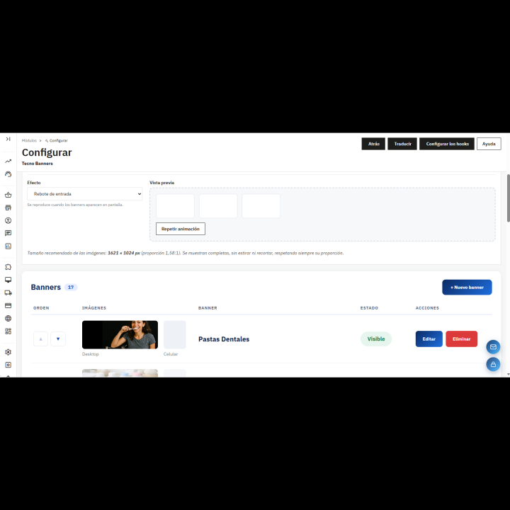
🖼️ One image for each screen
- Each banner has one image for desktop and another for mobile.
- You can upload up to 30 images.
- Turn each banner on or off without deleting it.
- JPG, PNG, WebP and GIF formats, up to 8 MB each.
|
|
| |
| |
🔗 Links, titles and buttons
- Link on each banner, opening in the same tab or a new one.
- Title below the image, which also works as alt text.
- Button with your own text (by default, “Visit category”), shown when the banner has a link.
- Show or hide all titles and buttons with a single switch.
|
|
| |
| |
🎲 Random order
- Upload more images than you show and let the module pick at random among the active ones on every visit.
- Your customers see different combinations every time.
- The draw is renewed even when the page comes from the cache.
|
|
| |
| |
🎬 Entrance animations
- 7 options: no animation, fade in from below, zoom, slide from the left or from the right, 3D flip and bounce in.
- The animation starts when the block appears on screen.
- Respects the visitor's reduced-motion setting on their device.
|
|
| |
| |
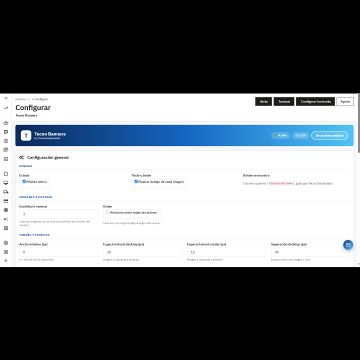
📐 Design made to fit you
- Maximum width of the block, or the full screen width.
- Side spacing, set separately for computers and phones.
- Gap between images, also set separately for computers and phones.
- Top and bottom margin of the block.
- Rounded corners (not applied when the block uses the full width with no side spacing).
|
|
| |
| |
⚙️ A control panel made to fit you
- Switch to show or hide the whole block in the store.
- Shown in the store's top column (displayTopColumn).
- All settings and banners in a single back office panel.
- Panel available in English and Spanish.
|
|
| |
✅ Benefits
- Your categories and deals, one click away from the very top of the store.
- Images designed for each screen, with no distortion.
- A showcase that changes by itself with random order.
- Everything is managed from the panel, without touching code.
|
| |
Requirements
- PrestaShop 1.7 or higher.
- A theme that shows the displayTopColumn position, which is where the block appears.
- modules/tecnobanners/uploads/ folder with write permission, to store the images.
- Important: uninstalling the module deletes the uploaded images and the settings.
|